Friday, April 8, 2011

Package Designs

http://www.looks.gd/media/CreativePackageDesign_01.jpg

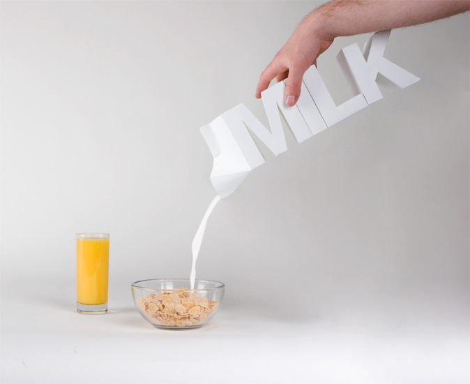
This design appealed to me the second I saw it. It's really cool because it's a package of milk with the word "MILK" spelt out. It is a very innovative design and is highly original. 

This is a very bold design because of the bright white color and the block style font. It is very creative and after seeing this you are unlikely to forget it. 

Friday, April 1, 2011


This is one of my most recent designs based on a quote. The quote was by an african american artist named Tupac Shakur, Also known as 2pac. Not only did he release many rap albums but he also wrote a book of poetry which is where this quote was from: "For every dark night there's a brighter day."
I choose my images based on this quote and the tone I was trying to convey. The background image of the dark house shows that "For every dark night...", and the moon and spirit of the wolfs show that "there's a brighter day". 


Kick Butts Day Poster 

Friday, March 4, 2011

Logo Design


 The two logos depicted involve negative space to create an effect of illusion. The first logo above (in the purple) is simply for my name. The bomb that represents the letter "O" signifies that I am the bomb...
The second logo is for a shoe line called "Smooth88". I created the 88 from negative space by putting the word smooth on top of a mirror image. The hardest part of this assignment for me was initially coming up with the ideas and making them happen. 


Friday, February 11, 2011

Line Design


This is my first piece involving line design and a black and white color scheme. The elements of design that I included are balance, a focal point, movement, and negative space.

The assignment for this first design was to make a line design without any fills, only strokes and lines. I made the assignment my own  by making some unique swirls and by blending objects together.

When designing this piece i really focused on balance more than anything. Every object in this design has a counterpart to balance it out. I started with the broken up lines and then added the swirls that loop around and shrink to create depth.